While there are different color palettes, it’s best to use contrasting colors when designing websites. Learn more about color theory and the use of color to represent your brand.
Isaac Newton Discovered More Than Gravity
When we think of Isaac Newton, we think of a man sitting underneath an apple tree who discovered gravity after observing an apple fall. However, Newton did not only advance science. He also made a tool that designers and artists rely on today: the color wheel.
We’ve all seen this wheel before, even in passing. My elementary school art teacher had one (or several) on her wall. In design, we use the color wheel to help us create palettes that look exceptional. While having a beautiful color palette is necessary for a brand, it also significantly impacts a website. Luckily, you do not need a Ph.D. in color science to use colors to our advantage!
Sometimes, we choose colors that “look good” to us without much rhyme or reason when designing a website. While our gut might be correct, some basic knowledge of color theory and how colors interact is a great asset for designs. Let’s discuss colors and the importance of contrast on websites to highlight conversion points for users in this blog post.
So, Color Theory…The Theory of Colors…What Is It?
“Color Theory” is merely a term used to describe the science of how colors look and feel with one another. In basic terms, you can think of color theory as what colors look good and bad with one another. For example, you would not want to paint a bedroom with neon red and yellow stripes! That would be a little much.
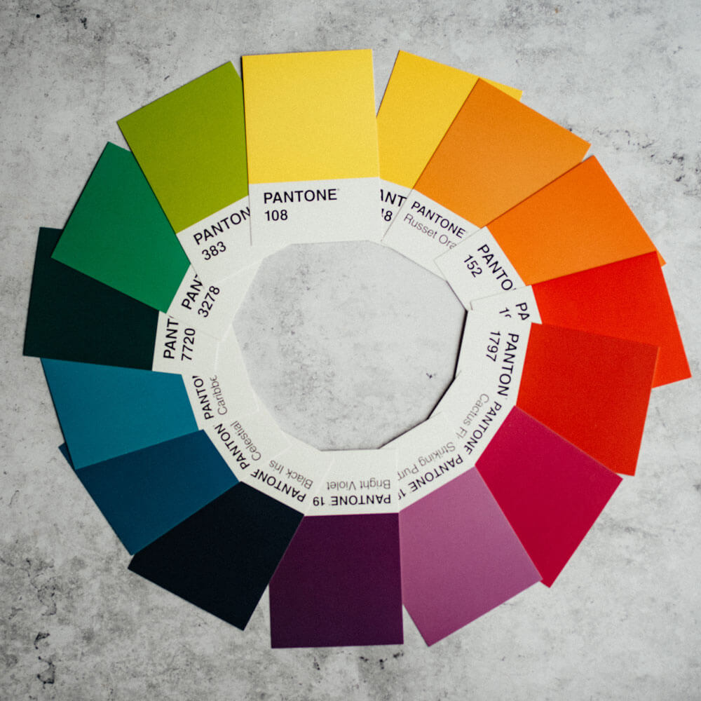
On a color wheel, we create palettes based on where each color lies. Let’s spotlight some terms for palettes below that are commonly used by designers:
- Complementary = two colors directly across from one another on the color wheel
- Monochromatic = one color with multiple different shades
- Analogous = colors next to one another on the color wheel
When creating a palette for a website, the type of relationship we want our colors to have is a good starting point. Some designers use different tones of the same color (e.g., blue) as a color palette. Others, like me, focus on complementary colors to provide contrast.
Contrasting Colors on Websites Bring Me Joy
Imagine going on a website with a gray background, gray content sections, gray text, and a gray button. Everything would blend! Such a scenario signifies the importance of complementary colors on websites. We can use colors to our advantage to separate content and highlight CTAs (calls-to-action). These are points on a website where users can convert (e.g., contact, buy a product, book a demo, etc.).
Some businesses prefer to stick with a monochromatic or analogous color palette. However, I always emphasize the importance of incorporating a contrasting accent color into the palette for CTAs, such as buttons. We can be more restrained in our color choices. But, use an accent color for conversion points at a minimum.
When users look through a website, it’s crucial to make opportunities for conversion to stand out or risk users scrolling right over them. On Spark Creative’s website, we use different blues as our primary colors and incorporate a bold orange for our buttons to emphasize certain parts of our copy (e.g., “Ignite”). You might miss our CTAs on those blue backgrounds if we used a similar-looking blue for our buttons.
Do Not Forget: Colors Have Feelings Too!
The science behind color theory also deals with human emotions and feelings when presented with a color. For example, red evokes feelings of romance (hint: Valentine’s Day is filled with reds, right?). With this in mind, choose colors that match a brand’s tone. For example, a website for an upscale jewelry store in the middle of Cleveland might stay away from a bright orange with more of a youthful feel.
Picking colors is not a perfect science, and there is some strategy that goes along with it. In the above scenario, maybe all of the jewelry stores in Cleveland are avoiding orange, and they want to distance themselves from the crowd. You could be different and use the color orange!
There IS a Tool for That!
There is no perfect, foolproof way to choose a color palette for a website. To be successful, we need to have a strong pulse on the brand. How do we want users to feel when they see our brand? What do we want our brand to represent? What colors speak to us?
Pro tip: My designer friends and I use Coolors.co to research and choose color palettes.
Spark's Three Takeaways
There are many color palette types, such as complementary, monochromatic, and analogous.
Color theory explains the relationship between colors and their meanings.
On websites, use complementary colors to make conversion points stand-out.